
So, as part of the overall marketing of the novel, the publishing process, an ecommerce solution and to publish the video blog documenting how I get on with everything, I needed a website.
Visit this web-site - WebDesign499 for more details.
This isn’t as easy as it sounds though, because when you start thinking about building a website for something that you’re ultimately marketing to sell, a collaborative media project like Operation Concrete and all that is contained within, you have to start thinking about a brand. You’ve got a product, you need a brand for people to make clear associations with what you're doing in their heads.
Now, years ago, you needed tonnes of money, lots of man hours and serious knowledge and expertise to build a brand. Today, like most things, the cost of implementing a brand has dropped considerably due to a number of factors. Key one’s are the incredibly low cost of publishing content online, and the facility to market yourself with other consumers easily and quickly with little cost, again, online.
But it’s not all that easy. I essentially had to brainstorm the brand for Operation Concrete, which has been an interesting undertaking. Years ago I put together a small music magazine in my home county of Cheshire in the Northwest of England, so I’ve had a dabble at this before, but this time I wanted something more than just a text based font logo. So, I went to the drawing board, I scoured dozens of art and typography base blogs and started making clippings. I decided on a few basic elements fairly quickly;
- The colours involved had to be bold and impactful and kept to a minimum
- The design, whilst looking good should essentially be kept as simple as possible
- I’m currently mad about Helvetica and want to use that font
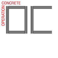
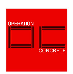
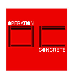
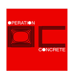
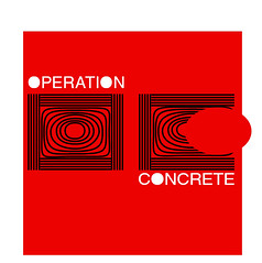
So, I dusted off my old copy of InDesign from my magazine days, and got to work. I love this stuff, the design side of thing is really interesting and I evolved a concept of lines, you can see below in the images, or go to the full size image Flickr gallery.
1. 
2. 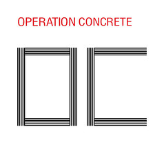
3. 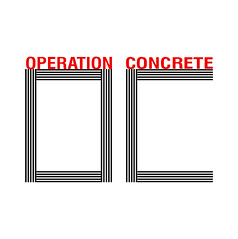
4. 
5. 
6. 
7. 
8. 
9. 
10.
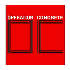
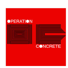
As you can see, there’s a definite evolution, these are the main 11 designs out of dozens and dozens, I’ve also missed out all the really bad ones that came right at the start, they were atrocious. I love the process of taking some key elements though and just playing around with them until you finally land on something you’re happy with. I just jumped on MSN, showed the ideas to a few people, got some ‘that’s cool,’ ‘that stands out,’ ‘I don’t like that idea,’ type comments and landed on the concept below. Click here for more info www.muraledesign.com
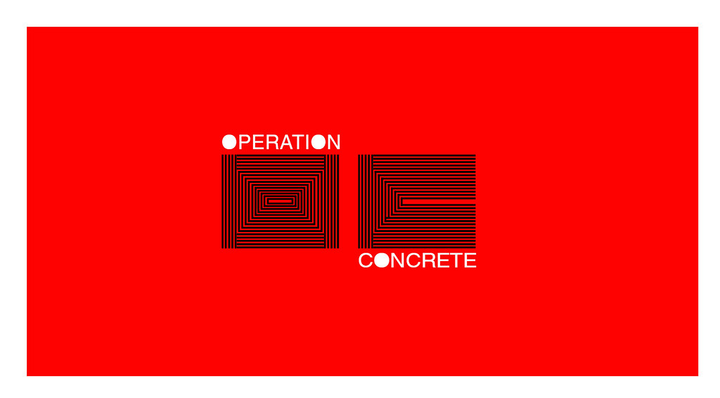
Now, I’ve seen the lines thing done before, but it’s not ‘owned’ by anyone. This means there’s not a specific brand associated with it, so I won’t be infringing on anyone, and I won’t be mixed up with anyone. Also, with the Operation Concrete moniker, I had to avoid looking like the OC television show, so I decided on three colours, super ridged and very bright. Total opposite of the OC, and conveys the general idea behind what I want to achieve. If you’re bold and stand out, you can achieve what you want.
I’d say, if you’re looking at designing your own brand around your novel and or project for launch just follow a few basic steps:
- Bullet point your key elements of what you want to achieve in with key words,
- Understand the colours you enjoy, and the ones that you want associated with you
- Learn a little bit about typography and design by reading some tutorials
- Horde as many design and typography clippings as you can to get ideas
- Splash out for some decent software like Illustrator or inDesign
The website is officially live now I’ve finally settled on how I want everything to look. Operation Concrete is there, the first video blog post is also online, albeit not as good a quality as I was hoping, but I’m waiting to hear back about sponsorship from Canon before I spend my own money on equipment. So, I’ll be video blogging a lot more from here on in, interviewing those involved, showing how the whole process is evolving and hopefully creating a resource for people to get some cool information from about self publishing and print on demand services.
Get the best anti thief devices by Continue Reading - SecurityInfo in our security website.

2 Comments
1 RG Sanders wrote:
Nice one - on the site and on the logo. I'd say more, but baby daughter on chest etc etc.
2 Alexander Field wrote:
Bravo for getting a site going to market your novel. I'm writing one myself and this sounds like a fantastic idea. Writing a novel can be a strenuous process and it's inspiring to see someone go to such lengths...I'll have to go check out the site now! : )